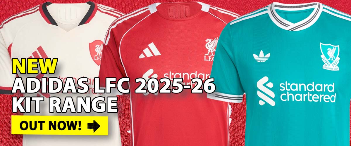
Update 19th June 08: The New Liverpool FC Away Shirt is officially unveiled and available to order here

Update 25 April 08: The New Liverpool FC Home Shirt is officially unveiled and available to order here

It’s that time of year when speculation begins on the look of next season’s shirts and kits.
A number of designs are starting to do the round and our forum thread discussing these designs is here.
The following have not yet been confirmed by Liverpool or adidas and as such may still be early prototypes.
The new LFC Home Shirt 2008/10
The new LFC Away Shirt 2008/09
The new LFC 3rd Shirt 2008/09
So, what do you think?


Many thanks for everyone’s comments. Yet again we have correctly ‘released’ the Liverpool FC shirt nearly 4 months before is is available to sell.
You can order the new Liverpool FC Home Shirt and receive a free El-Nino T-Shirt via this website.
Click here for further information:
http://www.anfield-online.co.uk/store/new-lfc-home-shirt-and-kit-2008-10.html
The new away shirt has also been confirmed.
Click here for further information:
http://www.anfield-online.co.uk/store/new-lfc-away-shirt-and-kit-2008-09.html
Thanks again.
like the new home kit, away one is bit dodgey and BLUE !!!!
are theses defo the kits?
home one is realy gd!
other 2 not so gd.
all of them r nice dnt really like the last 1 to much tho and oh ye ashley morris is fat
Blue!!! Get Rid
all boss
agree with most…1st and 2nd are acceptable..but do make it nicer =)
I like the first and second strips. I just hope to god the green thing is a goalie kit and not the third. It’s minging!!!
reds ok but grey and blue are awful…
I hate these shirts they look like bird crap
i think it looks good but the 3rd kit looks crap
well… what can i say… RUBBISH !!… the red one is not bad, it could be a lot nicer, the grey one isnt nice, yes it reminds us of early years, but come on !… and the blue one ! WTF !!!!!… if these are what they are going to be wearing next season, think ill stick to this seasons kit !!!
YNWA
You can call it turquoise, you can call it jade, you can call it kingfisher, peacock, amethyst or any dodgy shade of green you like but that 3rd shirt’s blue and there’s only one team on Merseyside that plays in blue – and its not Liverpool!
Away shirt should always be white, although this season’s black kit has looked good. Grey’s just weak.
First shirt’s nice, though.
I think i speak for everyone when I say they’ll all look great with one of these on the sleeve
http://i149.photobucket.com/albums/s77/shea_rer/DSCN3060.jpg
Horrible!!! I love Liverpool but I wouldnt wear theese.
The designer must be shot. He must be blind!!!
nice home kit , again awful away kits and thats why i dont buy away kit
Home shirt ok,
2nd reminds me of old but have a feeling will turn out like that 30min scummer shirt about 5 years ago when they changed it at half time. quite like the white we got atm
3rd dont get me started -i bet the yanks had a say. lol
the red one is amazing the second one is wicked but the third one is just gay
the home 1 looks nice the grey 1 supposed to b florescent and the blueish 1 is nice its jus gna take ppl tym 2 get used 2 it. grey 1 jus candy tops bring bak the good old days. come on u reds!!!!!!!!!!!!!
red kit is borderline good but not the most visually exciting kit ive seen! not fussed on the grey but could maybe grow on me and the green looks like its been designed by a blind german goalkeeping coach! absolutely awful.. floppy collar, terrible colour and no design to talk about! who gets paid to design these things!?
good to see the collar gone on the new home kit…the grey is a nice throwback..as for the third…the less said the better
i love all the kits they are lush
Why can’t they just stick the adidas badge over the right nipple to balance it up? Such an obvious design error.
i love the red and grey one…class!! aint so sure about the blue though!!!
Nuthing can be as bad as the 3rd kit we had, I think 93 or 94? The orange and black one. Disgusting! That green/blue one is quite nice compared
im a utd fan but im lovin that grey kit – I’ll def buy it
Home shirts red,thats all we need.Away or 3rd should be the old green and white 1/4 style.Stick Chang lager on the above 3rd and what do you see.Enough said.
like the new home kit but away kit coluor horid otherwise niiiiiiiiice!
The home shirt looks good, the current away shirt is a lot better and for the 3rd one i really like our current european kit, is fantastic!
We should keep the crrent home kit without the floppy collars. Same neck design as chelsea’s would be good.
Forget the grey. Our current away kit is much better.
As for our 3rd kit. Do we really need 11 goalkeepers in our team?
The home shirt is alot better than the 1 with the collar n im loving the grey 1 looks like the old candy shirt we had back in the 90’s and the blue 1 looks abit crap but im sure i can get used ta it.
The home shirt looks good but I think they should use the same design of the black 3rd shirt for the home kit. But change the shirt colour to red and the strips to white, the new grey one is fine but that blue/green one looks crap
i reckon that the new training top design should be put forward as a design of a playing shirt for liverpool
i dont like any of the shirts as they are very boring i think that the shirts at the moment are very gd and that the shirts should be based on the old ones which only a few changes so that it does not look so boring
There not to bad, they will look better in the shop windows & when your wearing them, put it this way, i’ll be buying all three of them, if they are the final design.
i think the kits are ok, like the home jersey but the other to not so sure on them !!!
I think the blue is terrible ‘coz it’s just not our colour! the grey is… boring and a bit daft :~(
The home is a photocopy without the collar
let’s hope they are prototypes.If they’re not, they’re not coming into my house!
adidas – NO!
Home kit is ok but boring.
Grey is always a bad idea.
The third kit looks like a ref’s shirt.
Let’s have some creativity and imagination.
The kits are real good,i would prefer white or black instead of grey.Or keep grey and change the design.
like the home kit but not too keen on the grey one – also not sure of collar on green one
I think all kits are horrible and we should stick with the kits we have got now, if not change them!
to redder than red man I know it’s about the team but they can not play a game in the birthday suits. When we are wearing the jersey we are showing our support for the team and the club. So we are not as stupid as you think! So when you say CUM on the reds do you mean Come on the reds! or Cum on the reds? ha ha!!
the home one is nice the champions league is boss
the red kit is nice…
but wot the hell is with the grey n blue?!?! they look crap
hope we do have that home kit though
COME ON U REDS 2NITE!!
gd luk tonyt the reds and nice kits
these kits are alryt the red and green are the best thanks
nogga dog
WALK ON… WALK ON!!!
you are all f**kin stupid its not about the kits its the team that counts cum on the reds
LFC 4 LIFE
love the home kit. as for the others.Hmm dont really know.away one looks like the old glenn hysen kit,the 3rd one definitely the goalies. maybe it will grow on me.we’ll see
i like the home and away but not blue no way
I like the home and the grey one! But they are very plain!
That 3rd one oe keepers jersey as it looks like is horrible! But I hope that they come with a better design.
That ‘3rd’ kit is the goalie’s kit! That’s so obvious.
plz have another design n keep white/green color for away kit. i don like at all..
i think they all rubbish and need alot adding to them and the blue is crap
What the fu**! Blue?!! There must be some one who lost their minde!
Gray i fine, Red are greath, but blue is just an discusting collor!
The home and away kits are lovely. simple desighn maybe the badge in the middle of the shirt tho?
The 3rd kit is an absolute no go! BLUE?!
I supose the evertonians could buy it as well and then at least have a club in blue that wins things in there wadrobe.
YNWA
i like the kits generally but the home strip would look cool if the stripes continued down the whole length of the sleeve and the white stripes and sponsor colours changed to gold. Also i would love to see the euro stars included (hopefully 6)
I dont like the away kit and the 3rd kit also look ugly. Change the color please. I like the yellow shirt being used years ago.
blue!!! BLUE!!!! Nuff said
We will NEVER win The Premiership unless we switch to Umbro…ha-ha-ha!!!!!!!!!
the home kit is good the silver one I think we should just stick with the white but different designs the third kit should be the current black one
3rd kit look like kepper kit.. not good
I like the red i like the grey but who thought of bluey green for the third must b jokin how bout white with red or black with red?????
You all know that the 3rd kit is green right?
This seasons kits are awsome as they stand! i absolutly hate the green/blue 3rd kit!
This seasons away kit (the white one) is brilliant, and the black kit is good as a 3rd! if you have to change anything it would be good to see a yellow shirt with blck shorts!
Home kit is nearly the same, so that is fine, but what happened to the collar, without it the shirt will look sort of like chelsea’ current one, and nobody wants that!
If I wanted a Blue Kit them I would be a toffee, there is no way we can get rid of the third kit for this, the black is THE one, best kit we have had in years!!!! Loving the silver, bringing it back to the winning days and hopefully the kit will rub off on the prem.
I like the current kit. Red of course and the black and white kits look really good. Not a fan of the grey and the blue is unquestionable!!! No way, stick to the current colours, they suit and all the players look great in them!
i cannot believe there are people here who are ok with BLUE.. this is an Everscum colour and i for one will never wear it!! home and 2nd are cool..back to the 80’s glory day kits but no way to blue..put some thought into it chaps!!
The home kit is barely passable, both change kits are an embarrassment. Blue for goodness sake?!?!
No surprises though, we have had a decent kit since before the ‘hitachi’.
not for me im afraid like grey 1 a little bit jus not as good as last sesons kit liked all of those!!!!!!
Does anyone know what the shorts will look like? The colour of the shorts could make a difference of opinion, and totally change the way the kits look all together.
the red shirt rules so does the grey but the blue one is ok but the new shirts will show the boys off in them
love the home shirt, really stands out
the away shirt im not sure, it looks a bit dull to be honest
dont really like the 3rd kit, it might look nice with the shorts and socks though. Although the shirt alone looks like a keepers top and its a bit embarrassing if we have a kit that is blue, the evertonian jeers would be endless :S
Red one looks ok – nothing special just Okay
The grey one looks class – a throw back to the good old days
The blue one is CRAP – keep blue kits for crap teams like Everton!!!
like the red and grey one hate the blue lfc are red n shud stay the reds that 1 needs to go over the road to goodison
well, its nearly exactly the same as the one now,
but i like the unusual colours,
im a man united fan, so i can’t say much about bland kits, but the home shirt could be a bit more unique,
the red shirt is awful they should make it like the black away one it would be much better
I like the Red kit and the grey kit. Modern smart versions of the classic Candy kit. I can see the faces of Barnes, Beardsley etc wearing it very clearly. I want to see Torres, Gerrard, Babel, Mascherano wearing it next year, fantastic.
The grey kit, same sentiments really. Its the Candy kit again. The new lads are going to look fantastic in it.
The third kit. THE THIRD KIT. WHAT THE **** !!!
Blue ? BLUEEE !?!?
It is disgusting and i cant imagine what the bloke who designed that was thinking ! Its awful ! Bin it immediately. This years black or white were good, use those colours, but BLUE ??? Get! A! Grip!!
ahhh back to my earliest memories of liverpools 80s hay day id buy them for a dollar
I like so much the red jersey, the torquise one is not so bad, however better if it will be carlsberg’s green; ’bout the grey i prefer will be substitute with a yellow & black one, like some years ago.
I’m a true Liverpool supporter but the kits you come up with ar rediculous! We have always played in red and we still should, I know you have a red kit but it the same as the ones from last year and the year before! WE DONT PLAY IN BLUE GET RID OF IT! I like the grey though
i want all of them dont u
Home kit borin goin back a couple of years, current home kit much nicer, Grey one borin and dull and torquise one ugly design. Im sure addidas can come up with a much better design these are just borin and when your payin 200 quid ago(3 kids) for each kit you want somethin a bit better than this but most of all please make sure the necks are big enough to go over the head unlike the black one !
I think the 3 strips look absolutely cracking. Dont have a problem with the blue kit however the collar is a bit suspect. Probably better with a similar collar to the other two.
I love the Red and Blue shirt,but the grey one looks dull
I like the grey one ,but the green one sucks.Stick to the current home jersey,the new one looks plain
also we are not man utd!!!! so why the hell are we maybe having a grey away kit get a grip.
absoulute rubbish keep our current kits but replace our away with the 06/07 away, why cant they keep the current home collar we have to, its novel and great i love it, and the fool who thinks the second kit should always be white, no!!!! it should always be yellow it looks the nuts.
Red kit looks quite nice,Grey kit looks dull and boring, green/blue kit with the silly collars looks like a throw back to the 70s!
I meant to add, the second kit should always be white. The most striking recent second kits of the last 20+ years have always been the white ones, so lets stick with it.
Grey one is foul, it looked ugly on the old kits first time round, So lets not revisit it please. Home one is okay, but I’ve seen better proposed kits on the internet that were far more stylish. I agree that it’d look better with the badge centred. .However I do like the Bluey kit particularly if it has collars. It’d look great with black shorts.
Love the home and away the grew is excellent flashback to a stronger club but BLUE?!?!
Love the grey one
i am sorry but come on, the red one is the only nice one there, the other two i do not like at all, they are to retro style for my liking
i think that the blue and grey shirt looks dull and should be changed for people to buy them but i have no bad comments on the red shirt but i realy think that the away shirt should stay whiteand the blue shirt would look nice if it was ice blue
The red is OK but the second needs to be white. The third shirt can be anything but blue………….. end oif comment!
the collar and the sleeves looks fine to me, no exegerating and simple. maybe you might agree the champions league shadow motive as the background for our european nights kan? personally i dislike the the idea of any grey kit in EPL just recall in the 1990’s when we wore the kit. very ugly and not progressive, looks pale and disgraceful. remember man utd decide to change their kit in the middle of the game years ago? well i dont want that happen to my lads.
thank you for buying Fernando Torres and if things went bad to worst, i hope no one will leave liverpool. the team is too good to be true. the line up just need more time.
The home kit is fine but dull away kits like the grey one which blend in with the crowd should be avoided. With players having so little time on the ball something bright and therefore easy to pick out is the way to go. What`s wrong with white or yellow?
Also, although I hate to say it, the bright yellow Chelsea away kit is about as good as it gets in terms of a colour that is easy to see in the blink of an eye.
The home shirt, except the collar, doesnt seem any different to the present and so wouldnt spend 40 quid again. But really like the grey shirt like beautiful 1989-90 one, but not quite as cool. Could have been more adventurous – as its addidas have three white stripes across diagonally like 1991-92 kit? For third kit would prefer an emerald green version of the 1991-92 away kit.
Liverpool 4 ever 🙂 this is cool shirts i like them all
First and third kits are mint,and second is awesome, i`ve been hoping the grey would come back at some point now let`s hope we play like we did last time we had it, and start to dominate the league once again.
I actually like them all especially the home shirt, it’s gorgeous. I’ll defo be buying that one when it comes out! Can anyone tell me where I can see the goalie top? I LOVE PEPE REINA!
different..
The Home jersey is good, Away kit i can live with, but the 3rd kit should be kept as this seasons. wat was wrong wid this seasons for the away and 3rd kit anyways??
personally i dont like any of them. I would much prefer the green and white away top of the early 90’s( the chequered effect one ) and a home top from the same era,they were the best.
The Manager is getting worse,
The Team is getting worse,
And now even the kits are getting worse,
What are we going to do????????
Like the red and grey but not the blue one
p.s when can we order these…
The grey is ok, but the red and green? wtf? i can design better stuff than this, i’m 14!
i think that the new retro style home is nice
but jus nice u no ,,
the away kit is as every1 seys brings back memories of the good old days nd the green,, its alrite but no collar plz
i think the kit makers at liverpool must have been kidnapped nd everton kit makers have taken over without any1 noticin
NO BLUE, we are not the bluenoses. The third is GREEN!
really really like the grey 1 but not 2 sure about the other 2 home 1 isnt much different!! YNWA
i like the home kit but the away kit and the 3rd kit are not good change the away kit to white
make the greeny/blue kit a pure blue and change the neck color to white. sorted 😉 home ones aiyt bit basic n simple. away one looks like u just pulled some old kit out of the charity bag :O.
make the stries and the addidas logo black-or white, then move the liverpool crest to the center of the top underneth the addidas logo. liverpool u need a proper kits designer 😉 email me !
An all white top and bottom would be smart too. clean and intimidating. no frills and let the football do the talking. not the ugly loud jerseys…blegh!
The designs justkeeps getting worst and worst doesn’t it? And i just don’t get the green…why the hell is there green in liverpool’s colours
i’d stick with white and yellow…maybe black as a neutral colour if a third kit is really required….but green…lord have mercy…maybe that’s the reason for our applaing form and luck over the years…if you know what i mean….simple for me…home-red, away – white top, black shorts, third….anything but green, please.
cheers!
The home is really smart, the third IS green, definitely not blue, noone would allow that. Although adidas gave us some blue alternate goalie tops in the late eighties and nineties.
the home and away shirts are miles better than our current ones
I like the red and the grey, but the blue/green sucks!
Maybe we should have a green 3rd kit…
To give some recognition to CARLSBERG
Leave our red jersey…
i reckon our black jersey this season looks great. But the grey and blue dont do it for me.
GR8 all of them
love em all
i love the grey one topclass i think the red one looks like this seasons one but there great
away with the 3rd kit LFC is THE REDS !!! :,
Not keen on any of them…..prefer the current ones. Not keen on grey as a away shirt and the 3rd one looks like a team of keepers has turned up to play.
LFC needs its pride back…pleeeeease
IF these are genuine then I won’t be buying any of them however my son of 14 quite likes them ! So that shows what I know !!!
The grey will bring more gloom and doom to LFC. Get rid of the ugly colour!
Brin back the collar to the shirts. Collarless is like being sissy!
John, we’re ever you found them they have to be photoshop fakes…
Horrible. Shocking.
I really liked this seasons kits… The white one was nice looking and the black one was awsome… I’m indifferent towards the grey one(I like the white one much better) and the blue kit is hideous… I thought this current season they really got the kits right… atleast grey is better than yellow… that is really the only positive…
Yep. Red home kit OK, away kit green n white harlequin with red adidas stripes, black shorts and red stripes, white socks red bands. Third kit has to be yellow. Identical to the centenery shirt. Yellow, black round collar, black shorts, black socks, yellow bands.BRILLIANT and this should never change as a third kit. It’s the law don’t you know!!!
Red kit looks fine and dandy but Grey..infamous grey? Remember the Palace result in the FA Cup Semi final? I prefer a white away strip with red stripes or King Kenny yellow. To be honest I think the away kit should be a harlequin green and white shirt, black shorts with red adidas stripes on the shoulders and shorts. Ok we lost to the Mancs in the Cup final wearing similar but let’s turn back the clock. Grey? no no no
the away kits colour is awful
they should take away the 3 stripes on the side but only on the home 1 we are NOT nottingham forest lovin the 80s style grey 1 but the 3rd kit kit is a disgrace WE ARE THE REDS NOT EVERTON it should be green yellow or white
Hey guys!
I can just see Gerrard lifting the premiership title in the grey one!!! LOVE IT. Just like the good old days. COME ON!!!!
The home one is soooo smart.
The 3rd kit, well, i just cant wait to see our boys in it, tearing up foreign opponents.
Ps, I agree with the collar KEEP it and can you make our badge BIGGER on the front
Home shirt is bad second one GREAT 3rd one also bad, keep the white one.
i think that adidas should base the new shirt on the old 1960’s or 70’s shirts and bring back the liver bird with L.F.C under it and what blue nose b*****d thought up of the 3rd kit.
IN RAFA WE TRUST
YNWA
They look great! 😀
I like all three 🙂
Wow!
The design team have been working overtime on this one (rollseyes). What a poor selection – especially the blue/green (blue on my monitor) third kit.
Personally I like the red (home), white (away), black (third/Europe) arrangement, but I kind of hoped for something more inspiring design wise. Very dull.
Hehe 🙂 Is this the missing piece to the Liverpool JIGSAW? Is this the TITLE WINNING KIT – Seriously though it is an improvement to the last (pardon any cliches)- I just wish they used the old ADIDAS 3 LEAVES LOGO and probably could have done with a thin strip of RED just to overlap the WHITE parts of the V-NECK. – Love the silver – reminds our title winning season 1990 🙂
there nice but the old shirts were fine too…we should have a white shirt too i thing
The red one is ok, I would say better than this seasons. Grey is very dull. And the blue, what a disgrace that is! Come on Adidas give us somethin better than that!
you lot know nothin….those kits are nice
your all just too old and dont no what style is
new designs are good
the new home kit is better , just need to get rid of carlsberg as sponsor
dont back to grey keep white with new design and make shorts white as well
black kit keep as well as new aqua kit but make stripes red
These new shirts are fantastic, displaying a lot more imagination than the repetitive cycle of yellow and white away kits. Hark back to the glory days of John Barnes and Peter Beardsley. The 3rd kit is fantastic, blue yes, but the spectrum of colours allows for a foray into the territory of the scummy bluenoses and Chelski.
The red one looks good, the blueish green one is horrible and I think the grey one reflects the attitude around the club at the moment ” Dull ” Time to shake it off and get back to winning ways. Come on the Reds!!!!!
I think they´re all looking good!! The grey i think is some kind of retrostile?!? If im correct there was a grey Jersey during the late 80´s or early 90´s…
And for you guys who dont like them, remember, take a look at Chelskis yellow jersey this year… Something like that would just have been terrible!!!!
they all look pretty cool to me
plain and simple
remember less is more
I dont know who these perry lads are but they make sense. I wouldn’t wear the away jerseys ina fit – Even Jan Molby or Dean Saunders wouldn’t look good in them!!
2 years since the last jerseys and this is all the designers can come up with ??? bring back reebok !!
They’re all Manky! C’mon you can do better than that, I was in the Adidas shop last weekend and theres loads of decent Adidas stuff!
Away colours are horrible! I reckon there could be transfer requests handed in when the players see this!
Please sack whoever came up with these and go back to the drawing board. You’ll have all Pool fans looking like Chavs in this gear! Can you not add the old Adidas retro logo back??
like the home and the away but the aqua looks really gay
I love the home and away but I’m not too sure about the 3rd kit. I do like the design of the collar on the current strip and would like it to return.
All the three jerseys should be okay on the design but I think that there haven’t any surprising this season. Should Adidas think more on that? It’s only the third season after they re-got the sponsorship !!
That’s obviously not enough for LFC fans all around the world!! The famous brand should think about it if they want to sell the jerseys so expensive!!
YNWA!!
I think all 3 are excellent. Hopefully this is what we can buy this summer ready for a proper title charge next season!! The grey away shirt was of course last worn when we won the title!
The home kit looks great, but i think they should of stuck to white for the away kit but with the same design. The 3rd kit is horrendous. Should of stuck with the black kit that looks way better.
Why are the away and third only for one season? Its a rip off having a jersey for one season!
Like it…
i like the red one, but if we get the grey one(which is growing on me) at least if we are getting beat at half time we can say we couldnt see each other and blame the kit!!! but the third one is a no, it looks like something newcastle would wear!!
*Y*N*W*A*
Not liking any of those! We’ll look like Marseille in that third kit!
Excellent – I hope they stick with them. Really, really nice, clean looking kits
I think it’s cool, better than the current ones. Only I’d change the blue version to pale yellow with red stripes.
Stick with the black 3rd kid and please stick with the white away kit
perfect But I don’t like gray color
Looks ok.
The crest should be in the centre of the shirt.
Keep adadis logo .
Get rid of the three stripes.
We are the REDS – KEEP THE STRIP RED!
Thanks,
Paul
perfect. But I don’t like gray color
Home shirt is a stunner, away shirt is absolutely horrendous. Third shirt is awesome.
the 3rd one can get a little better if we include black instead of this pale greenish color, with red and white strips on the arm and on lower front lower and upper back side
home shirt great .away errrrrrrrryuk third great
The home kit is very smart.
The away kit – you can’t be serious? How the hell are they supposed to pick each other out on a misty, wet and miserable mid-week fixture in Sunderland? (Of course, that’s assuming Sunderland meet us in the cup next year…)
The third kit – from the sublime to the absolute ridiculous. What is the significance of a turquoise blue in our proud history.
As if we weren’t a laughing stock already!
This new shirt is definitely better than currently used)))
I love the grey away kit. It’s a throwback to the successful Candy days….
Well, the blue colour shirt is nice, but please, no collar!
Not very exciting designs imho. The grey kit is very late 80’s. I can imagine Beardsley and McMahon wearing it. What a horrible shade of green the 3rd kit is. Still better than the current black kit though. With the black collar, the green kit looks like a goalie’s jersey. I’m getting images of a Belgian or French team from the 70’s-80’s who had a similar green kit with a black collar kit, can’t recall who though.
I don’t see why we have green kits, or black either for that matter(I know the reason, money, but I don’t know why those colours are chosen). The home kit it red, the away kit should be white. If you need a 3rd kit, maybe a yellow kit.
I think they are boss. Especially the home kits. I love the retro look. A through back to the glory years.
I don’t like these design, especially the gray one.
Fantastic. Very Nice 1st and 2nd shirt. Color on the 3rd was real ugly. Go for black… and please, white or yellow 2nd shirt would be nice.
Please do away with the Grey Away shirt.
ABSOLUTLY NOTTT… the red one is decent and looks good but the others are horrible. We should definatly keep the white and black as alternate and away colors..trust me this will not go over well with a vast majority of true Liverpool fans.
They look great and I think they are absolutely better than the old ones.
Blue? Is that a play on the original “Everton” kit that was worn the first few years in the 1800’s?
The Home Shirt & First Away Shirt…Said Colour is nice but the Shoulder part must add some curve Line just like the 3rd away Shirt. The Shoulder end up very ugly..i cann’t imagine the long sleeve shirt how it looks like. Put some curve or …just change it. One of the reason Liverpool FC cann’t get EPL Champion, Look at their Jersey…doesn’t look like a champion at all.
I hate the grey jersey. It looks ugly…………
Please do away with it.
I don’t like it, Retro gone Wrong
I really hope this is NOT our shirts for the next season. All 3 are ugly as a Man.Utd shirt.
Like them, but i hope the 3rd shirt has’nt got a floppy collar, a tight round or v neck is far better & neater looking.
i agree with the home and away strip comments but the 3rd strip would be nice using the same style as this season black champs league kit but keeping that blue colour
home kit looks nice the other two are horrible and a bit boring…away kit should be kept white with different design..not too fussed about the 3rd kit but again better when each kit has a different style rather than just the stripes down the arms…may or may not help you thank you anyway:)
omg this is bad, com upp whit some god stuff plz
Love the Grey, but…. BLUE??!!!
like the grey one, its a flash back to the good ol days, of barnesy,beardsley, aldo and rushie!