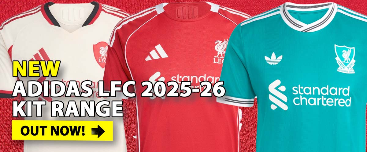
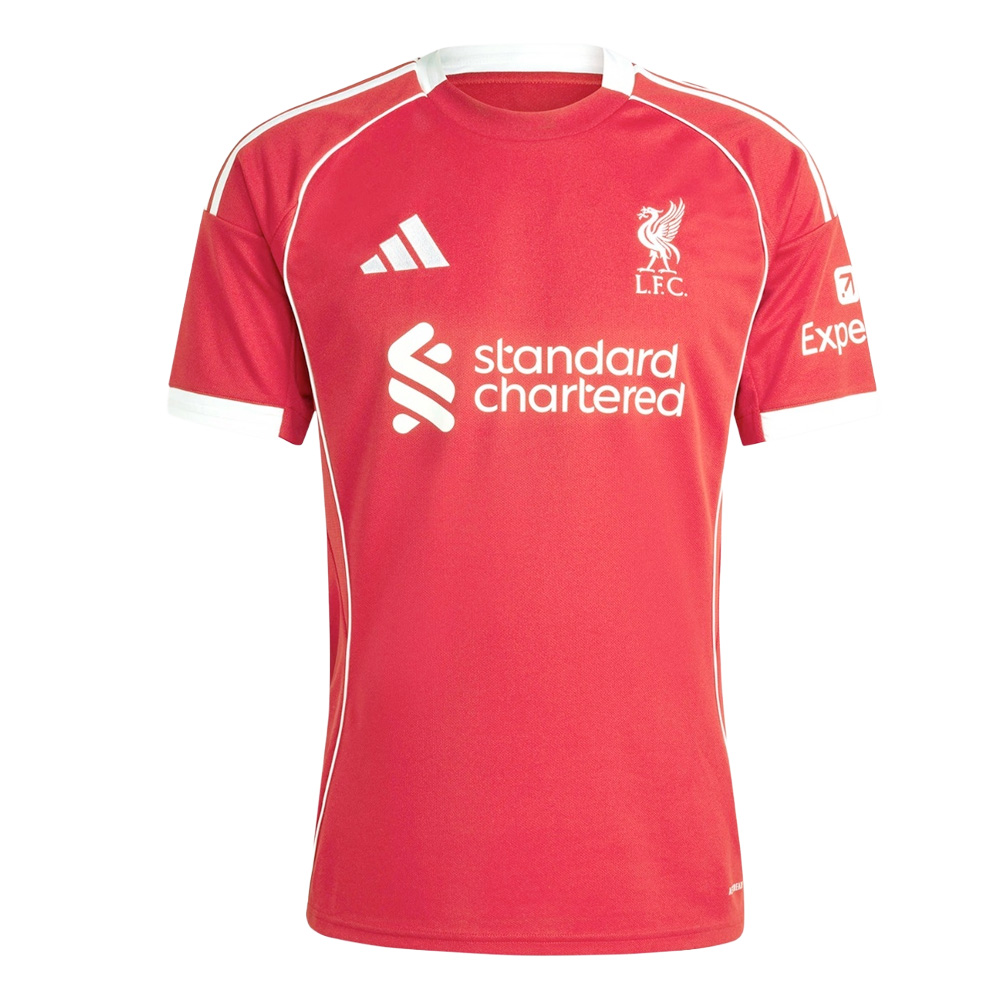
UPDATE MAY 2010: The NEW Liverpool home kit is here
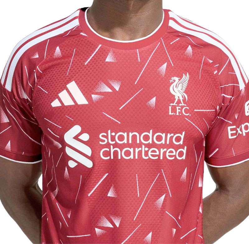
UPDATE JUNE 2010: The NEW Liverpool away kit is here
A number of Liverpool away shirt images have been doing the rounds for a couple of months now on our forum and other football forums, and some more have popped up in the past week.
Here is a round up of some of the images for the possible new Liverpool Away Kit for 2010/11. (Standard Chartered, you will remember, replace Carlsberg as the club’s shirt sponsor).
Thanks to LFC_Stuart for the links.

The next image was posted a while back. Could this be a possible third kit?
And just for good measure, the matching image of a home shirt. (The new Liverpool home shirt has been released and is here)

Just an update to this article from March.
Even though we all laughed at the ‘Your Will Never Work Alone’ it did turn out to be the right kit. Albeit with a different coloured sponsor logo.
Latest news story here:
http://www.anfield-online.co.uk/lfc-news/2010/liverpool-fc-unveil-official-away-shirt-for-2010-11/
Online ordering information here:
http://www.anfield-online.co.uk/store/new-lfc-away-shirt-and-kit.html
white is lookin’ bad. Should make it Red or something more striking.
Haha.. on the white away on inside back it says “Your Will Never Work Alone”..
white is bad looking,must change like red and other colour…
black colour?
not much look just a computer generated black kit
loving the gold kit
The home kit is a fake, if you go on the official Liverpool website it shows a different one. The away kit looks believable as it is in the same design as the real home kit. Personally i think the real home kit looks good and the possible away kit. Not sure about the 3rd kit, might have been a design for a champions league kit before we got kicked out of the race for 4th, still looks alright, would be nicer if it was like our old white and green oe.
its amazing got it today
bring the polo type one out lookin nice
Its fine what have you all got against it we all have are opinons and by the way please dont take this offencely lfc rules end of lfc story! p.s take a break lad
why has the yellow shirt got champions league badges on the sleeve???
are spurs going to wear a liverpool kit in the champions league?
Your will never work alone???
liverpool kits loks nice and i think it will look nice on the players
I too am an avid collector of these shirts, but this is horrible! Maybe, maybe the gold one, but the other 2, good grief! what were they thinking when this was designed? Mybe wer’e too used to the Carlsburg look, but still, they style, design … a real eye sore!
home kit is no good, but i like the gold one
I can’t picture torres wearing that home kit for some reason.
Im a regular buyer of all liverpool fc shirts, but i can honestly say not next season. The kits are disgusting and the sponser looks out of place. I know its all about money at the moment for our club, but come on give us something decent to wear. The home kit ok that might grow on me, but if that is the away shirt and the european shirt then im not buying it.
i hope with this new kit LIVERPOOL can win all match and can bet other club…..!!!! GO LFC….!!!!! YNWA….!!!!!!!!!
I love the “Your will never work alone” on the inside of the one jersey. Nothing says fake like a complete misinterpretation of the English language.
I think all 3 looks legit!
Home shirt reminds me off the Bayern Munich top. Its sweet enough for me.
Defo all fake inside the white on it say you’ll never ‘work’ alone ha ha there well blag !
your will never work alone? I’m guessin this was produced in the far east somewhere. shoddy.
I cant wait for the new kit to come out…Just waiting for it is torture…these proposed kits are definitely fake, I don’t like the idea of the white and red stripes on the away kit, I hope it changes…It’s about time we got new sponsors, I was bored with Carlsberg and ever since we’ve had Carlsberg, we haven’t won the League…Time for a new change and some new luck…You’ll Never Walk Alone 🙂
2010/2011 new kit
– The home kit is horrible. Why not consider some retro cutting….with collar perhaps, something like the image shirt.
– The away and 3rd kit was ok….so…so
sorry, look inside the colar, not colour
The white one is fake….look inside the collar, ‘Your will never walk alone’……i doubt adidas would make a mistake like that
white shirt = mingin
gold shirt = ok
red shirt = we are the reds not the red and whites, looks like a bayern or benfica shirt. anyway they are all fake.
I like it. I love Liverpool FC so much, and every shirt true the history was very nice.
This one is good, i think some retro from, maybe late 70’s, or early 80’s.
Detail with the button is realy original…
Greetings for all LFC fans from Serbia
They’re horrible. All of them.
Really like that new home shirt!
i like new jersey.. i hope this will be able to bring successful for the reds…. you’ill never walk alone….
but we have’tn seen the shorts and the gold one is ment to be the goalkepers kit
nah mate the grey ones the goalie that one will b our eroupe shirt if we get in
Glad we got a new sponser!
What is that scroll on the inside of the colar all about “YOUR WILL NEVER WORK ALONE”.
i love the gold i think its the best
Prefer the CL shirt but really preferred the carlsberg logo and sad to see it disappear after so long. The banks logo looks very corporate and the name is just so uncool. Beer company sponsor is better than robbing banks. Ok the better money will help!
Sorry but that home shirt is a shocker!!
Agree totally RETRO 80’S PLEASE !!!!!!!
Your Will Never Work Alone? Why does it say that on the collar?
For me…whether its good or bad , i don’t care as long as its Liverpool jersey i will wear it anytime. Its better to wear Liverpool Jersey which looks ugly than to wear a beautiful Jersey from other teams!
more or less the away kit will be that!
the home kit seems like a pyjamas..
the 3rd kit it’s clearly fake , adidas it’s still wainting to produce it , because we’r not sure to go to ucl next year(in my opinion we’ll don’t get it).
the design it’s the currently of this year , so we’ll have a design similar of the spanish kit 2010/2012
hope for a home kit red and gold , and 3rd gold and white or golden and red , also orange or brown and gold.
y’ll never wORk alone XD
if we don’t make europe do we need a 3rd kit?
the gold is HORRIBLE again. black and gold this season horrible also. = crap away record, jokes..
Actually it says ” Your Will Never Work Alone” 🙂
I guess it is a fake.
I prefer the black with gold writting away shirt! I don’t like any of these shirts 🙁
The gold one is quite nice, but I reckon it would look nicer if it was in black!
The home kit is not acceptable at all – it looked like a normal t-shirt and for the away kit they should try and do some thing to it ,to make it look nice
now all we need is a team to play in it not the crap we have now
I don’t think i can get used to the new sponsor, it dosnt look like a liverpool shirt without carlsberg on the front 🙁 . Also the third kit looks like vomit (however i love this years third kit). The home shirt looks fake to me, because of the buttons, and is it me or is the sponsor sewn on, that wont happen on a massed produced kit.
Sorry but the how kit looks like a Bayern Munich home kit ! wont be getting that ( why don’t they go for gold or white pinstripe on the red with a nice V neck like the 80’s that would be mint.
The white away isn’t too bad but loose the black all over the kit and reduce the corporate sponsors logo size or just use their logo !
As for the gold kit im not interested because it’s too close to mustard gold and the collar is run of the mill addidas ? i think we deserve better than that ! All in all pretty poor.
don’t think their the new kits lads LFC very good at keeping them under wraps until released reckon some dodgy kid in thailand made these
That’s just the thing. If you see the earlier links and the dates they were posted you would see that adidas are actually pretty dismal at keeping these things under wraps.
Although admittedly we haven’t had these confirmed from the same source who confirmed the kits last year and the year before.
They are not the new seasons shirts.
Adidas confirmed this …………………
Could you divulge what will be ???
Not a fan, the away kit looks like a baseball shirt
Yeah seen the erm ‘YNWA” inside the collar. Typical pre-production ones. But apparently, even with its obvious problems, this is going to be the away kit – except Standard Chartered is going to be in red.
White ones deffo a fake, look at the inside collar “your will never work alone”… says it all
it got worse
your will never work alone
lmao
stitching on the badge is terrible too
your will never walk alone (inside collar)
looks like the thai’s had translation probs
these come out every year and never look the real ones
They do come out every year. Usually we get a sniff in January not March. Last couple of years have been fairly spot on
http://www.anfield-online.co.uk/lfc-news/2009/new-liverpool-away-shirt-2009-10/
http://www.anfield-online.co.uk/lfc-news/2008/new-liverpool-fc-shirts-kits-200809/
like the white retro one dont think its real though as it says your never work alone on the inside the other two are terrible
they are defo fakes, look at the inside of the away shirt “your will never walk alone”
I really hope we do not revert back to a button up collar!
that bank logo is way too big and way too ugly
don’t think they would use the white one as it’s more last years design as most of adidas have the extra stripes at the end of the sleeve like the home and that 3rd kit.
i hope they don’t have any of them as they aren’t very good.
they’re not real!
Third picture is OK. CL shirt colour is awful, and home shirt collar buttons are very ugly too.
the home kit is disgusting. prefer the old pics of the proposed kit
Must be fake. Notice the “YOU NEVER WORK ALONE” on the inside collar of the white kit. Also, notice the buttons on the home kit. Thats a simple polo shirt, man.
I like the away kit, though. Nice red stripes.
Oops, I meant the collar says “YOUR WILL NEVER WORK ALONE”. Which is obviously wrong.
Well spotted big man. Must say I won’t have noticed that myself.
I just wanted to point that but I saw Martys comment first. At first I thought theres something wrong with my eyes.
Honestly I cant see Liverpool play in white and red stripes…its just not right. Doesnt fit with Liverpool. When I saw that shirt first thing that crossed my mind was a PSV Eindhoven kit xD
This is probably a joke
Will not buy them under the current ownership, it has been the worst part of Liverpool FC’s lifespan under these business men or should i say CONMEN.
Home kit looks like a Manu throw back !!!
Do not use this shirt, we play in all Red !!!
You’ll have Shankly spinning !!!!!!!!!!!!!!!!
Not another terrible GREEN sponsor logo??
Also why not swap the crests on the shirt around?
Stick the black liver bird, used on the back of the shirt, on the FRONT of the shirt in red with LFC under it.
And print the fussy crest in all black or red on the BACK neck?
They look not too bad, I would wear them anytime
Agreed!!!!! it looks awesome.
Not as a massive fan of the away shirt.
I’ve heard lots of people speaking negatively about the home shirt but I actually really like it. Would be pleased if that’s the one that’s released.
The third shirt is okay – a bit different I suppose. Would have to see what it looked like on though first before buying.